Acquired Product Integration
Goal: Adapt a useful but deeply flawed acquired product to Ivanti's design system and interaction model.
My Roles: Product designer, researcher, strategist
Impact: Delivered a new product that was consistent with the Ivanti product line. Extended the design system to accomodate new product lines' data visualization requirements.
External Attack Surface Management
The products in my other case studies from Ivanti were all designed to fix security issues that had been diagnosed.
But that leaves the issue of diagnosing the problem, and finding patterns in the problem to help plan remediation.
Situation
Ivanti acquired a product that specialized in finding all the places that a bad actor could attack. The basic workflow was pretty cool - the user provisioned a base domain for their network, and the product would send out "crawlers" to find the things - domains, applications, browsers, operating systems, tech stacks - that could be attacked. The user could then act on the information.
The problem was, the user interface not only needed to be adapted to Ivanti's design system - once you got past the initial provisioning, it was kind of a clunky, inaccessible mess.
Task
Actions
Make the "External Attack Surface Management" (EASM) product consistent with Ivanti's design system, interaction model and vocabulary.
The original product conveyed a lot of information - but did it in a non-standard way, with a largely non-accessible experience that relied on cryptic icons to get the information across to the user.
The Dashboard
The first order of business was building a dashboard that took the poorly-arranged and utterly nonstandard display of data from the original UI, and bring it into the Ivanti design system.
Which involved adding some new components and visual language to the design system.
This is the “Landing Page” from the main navigation into EASM.
It involved designing (and standardizing across the design system) a bunch of components for specific data visualizations; clicking on a KPI, an object or segment of an object (a bar, a bar segment, a cell in a grid, etc) would load the relevant list page (Exposures or Assets - see below) - filtered to reflect the data on the initial widget. Exposures, by the way, are various levels of vulnerabilities, while Assets are computers, applications, APIs, domains - basically anything a customer owns and uses that can get attacked.
Visual Language Notes:
Color - as usual, a secondary indicator - had two separate sets of connotations:
-
Teal and Orange: Parallel, different but conumerate data; e.g. “Exposure Count” and “Asset Count”. The intent was to show different, but related, objects in parallel, comparing the relative size of the collections; large collections of assets with small collections of vulnerabilities was good - seeing lots of teal and little orange was a good cue.
-
Maroon, Red, Orange, Yellow, Gray: Connotes severity and criticality. As I noted, I fought to collapse this down to the standard “Traffic Light” three color (Red, Yellow, Green) arrangement that had been an Ivanti standard for some time - but Product was pretty adamant, and it wasn’t a beach to die on. You may also note that the five color scale and the “Traffic Light” colors (red/yellow/green) are both used; there were cases where the severity scale was not needed. It was not an utterly satisfactory solution, but it didn’t draw any complaints or cause any visible issues in usability testing.
I designed this entire dashboard and all its visual components (with some feedback from other team members and, of course, design iterations with the Product Manager). I’ll explain them all below:

The Evolution Process: You Win Some...
Once the user "crawled" their domains, the back-end technology created a list of domains, applications and other areas with external exposures that could attract malicious users and attacks.
I redesigned it to fit the design system. The grid was pretty typical - but I added in research-validated KPIs that would re-draw the grid on click, to allow the user to focus their efforts on the important exceptions:
.jpg)
I don't have a "before" drawing - but there were no KPIs. The user was required to filter the columns to find the exceptions they were looking for.
This was fairly uncontroversial.
And others, you compromise...
As the scanners detected and fed exposures through to the back end, we presented the users a grid showing them and their most relevant details:
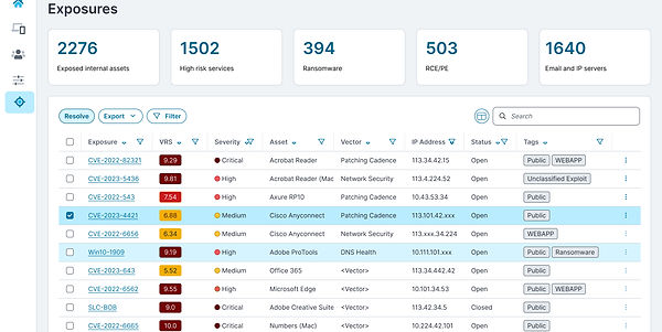.jpg)
In the original product, exposures were shown with a cryptic numeric code associated with different-shaped icons for different levels of criticality. This was a learnability issue - users in usability tests had a hard time discerning what the shapes meant, and they didn't really have a direct connotation with the numerical "VRS" value.
While normally we used a three color motif (Green, Yellow, Red) to convey criticality, research also showed that users needed to visually scan for different gradations of severity - which led us to develop an accessible five color grading system (Maroon, Red, Orange, Yellow, White). This involved a change in the design system - but it tested well, so it was accepted.
Also, applying an action to the individual line items involved selecting options from a "Kebab" menu located on the right margin of each line item - meaning the user could only act on item at a time; research showed that users frequently resolve unconnected issues together, and disliked having to do it one item at a time.
Next, the user picked the line items they wanted to act on (example: resolve), clicked the action button, and committed their action.

Situation
With the product adapted to an extended design system, it joined the Ivanti product line in 2025.